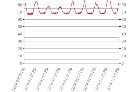
FileMaker Charts – Limiting x-axis Values
TOO MANY DATA POINTS on the x-axis can be a big problem for some data series in a FileMaker Chart. David Nahodyl of BlueFeather has shared a very nice solution he developed.
FileMaker has extremely functional charts, but one tricky part I’ve found is making the x-axis display in an appealing format. The values along the x-axis can overlap if you have a lot of records. Summaries can help with this, but what if you don’t know how many points you’re going to have to plot, or the range which would need to be summarized?…
So how can this be cleaned up? Really we only need to show x values at the beginning, end, and a few points evenly distributed between them.
Well here’s a calculation to help you do that!
Most beginner developers (and some experienced ones, as well) have fits with FileMaker charts. Hopefully this will help.

