Design Secrets: The Lowly Text Field
Designing Clarity, Accessibility and User Effort in FileMaker
How much is there to consider about the lowly text field when designing a form? Quite a lot, actually.
Consider the following traits:
- Clear text labels
- Short text labels
- Proper field size
- Visual focus for input fields
- Input hints (think placeholder text)
- When to how much helpful information
- Accessibility
- Font size (on desktop and mobile)
- Properly sized tap areas (mobile)
- Proper keyboard (mobile)
- Pre-filled fields
- Auto Complete
- Auto Suggestion
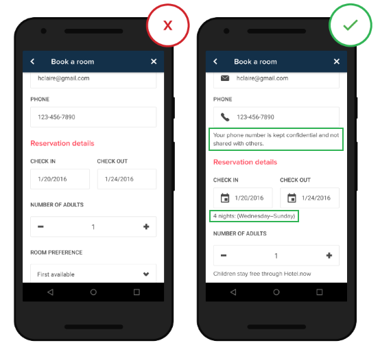
Nick Babich explains each clearly and succinctly in his post at usplanet.org, and offers some widely accepted guidelines to follow, such a text size, contrast ratios for different text sizes, tap area sizes, and more. and plenty of visual Do and Don’t examples:
From the FileMaker perspective, many of these issues are addressed starting with FileMaker 12 themes, and the ability of a developer to fine tune text fields is pretty spectacular and easy to apply. Consider the options available for a text field:
- Different settings for Normal, Hover, Pressed, In focus, and Placeholder text
- Solid or gradient fill – or choose an image
- Solid, dotted or dashed lines, with easily adjusted corner radii.
- Inner and outer shading
- Padding
- Alignment
- Line spacing, line spacing and tabs
And all of this is available via professionally designed themes, and any changes are easy to apply to either a single layout or to a the whole solution.
Combine these tools with the guidelines in this article, and there is simply no excuse for making a poor looking, ineffective form.
Read the whole thing and bookmark it.
Source: Designing Perfect Text Field: Clarity, Accessibility and User Effort — UX Planet
Featured Image credit: thinkwithgoogle

